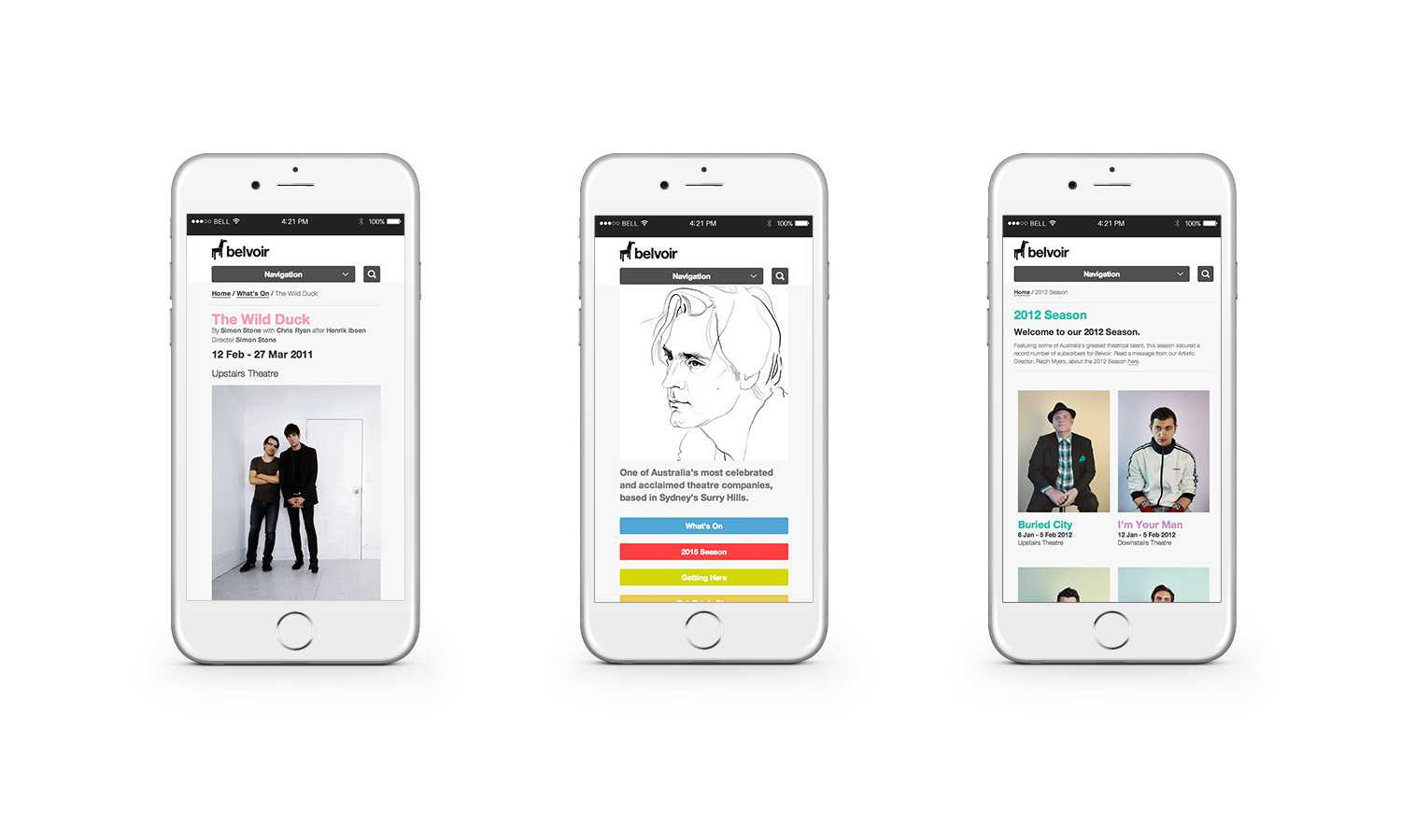
Belvoir Theatre
The premiere Sydney theatre needed a refreshed web presence.
Picket Studios created the design and backend for this project, while I was responsible for the front end build.
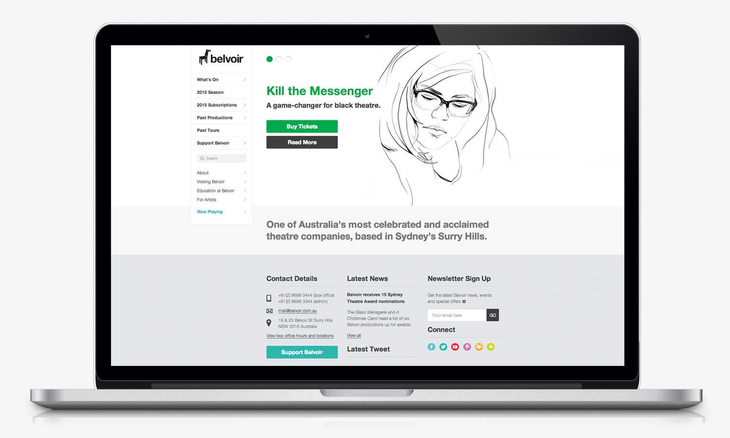
This was a relatively large site with a lot of functionality. Keeping the CSS profile slim was a challenge on this project.
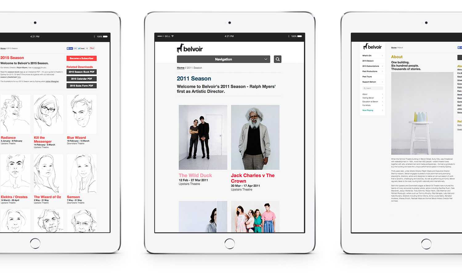
The site moved fluidly between desktop, tablet and mobile. Responsive websites were still very new at the time, with many best practices still being established. There were many quirks to work around, but it taught me a great deal about building responsive websites.